Now in Jira Agile Labs: an all new control chart
I’m excited to announce the release of a new version of the control chart into Jira Agile Labs. Why am I so excited? The control chart provides insight into day-to-day operations, so scrum and kanban teams can easily spot long-running issues for better flow. The new control chart is interactive, so digging into the details couldn’t be easier. Jira 6.2 enabled new visibility across the development process; branches, commits, pull requests, builds, and deployments. These new reports make it clearer where roadblocks lay to further optimize your team.
Lean practices dictate that the less work there is in progress, the more efficient the team will be. In other words, minimizing conflicting priorities helps the team focus and get work done. The control chart will allow the team to see long-running issues over one or several iterations. Also, estimation is one of the finest arts in software development – teams that are able to estimate work correctly have better control of their schedules, and relationships with business stakeholders outside of the development team. The control chart makes it easy to track estimates against actual delivery times for better learning on the team.
Let’s take a look at the new control chart. If haven’t read the overview of the new reports coming in Jira Agile, I encourage you to do so first.

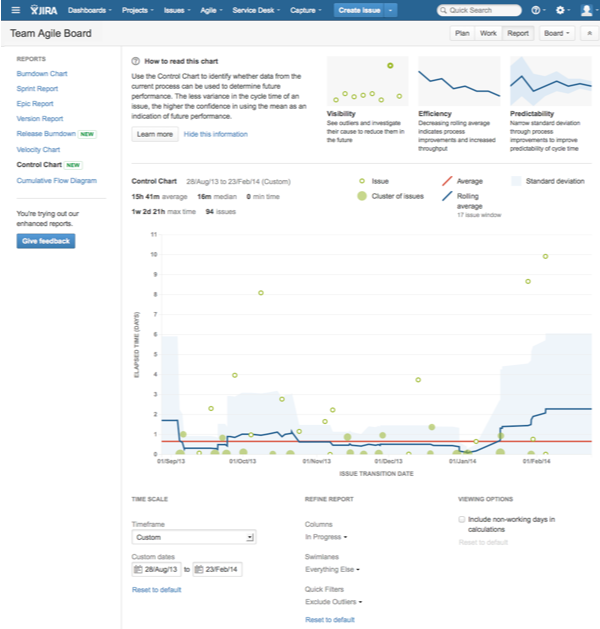
We’ve added guidelines to the control chart which help users understand the most important concepts. The new chart is also interactive, allowing users to drill down to important data. Customization controls are conveniently located at the bottom of the chart and update the data in real time. If you have feedback on the new chart, we’d love to hear from you – just click the Give feedback button to send your thoughts directly to the engineering team. We read each and every piece of feedback we receive.
Six key parts to the control chart
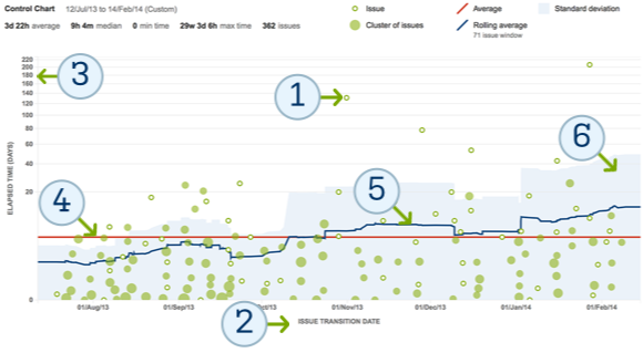
So what is this chart telling us? Let’s zoom in on the chart and look at six key entities every team should know to help minimize work in flight.

- The green dots on the chart represent issues. They are placed on the chart based on completion date and time to completion. Green circles represent single issues and darker clusters represent multiple issues.
- The x-axis marks the issue’s transition date out of the selected statuses. Many teams will report on the In progress status but the control chart can highlight any part of your workflow.
- The y-axis shows the length of time an issue is actively being worked on. Since In progress may be multiple states, users can configure the control chart to aggregate states like In progress, Code review, and Quality review – or show them all individually. More efficient teams take less time to resolve issues. In other words, lower numbers are better.
- The bright red line is the average amount of time it takes the team to move an issue through the selected statuses. Lower numbers are better.
- The dark blue line is the average cycle time. As the team gets more efficient, this line will trend downward.
- The shaded blue band is the standard deviation between the individual data point and the rolling average. More predictable teams have a narrower band of blue as each issue’s cycle time is much closer to the rolling average. A narrow band gives the team confidence that they can deliver future work in the same cadence.
How do I use this chart?
I look for the issues that stray away from the mean to see what types of issues are taking a very long time to cycle. A number of reasons can impact issue flow:
- The issue is too complex. The most predictable issues reflect work that can be resolved in 8–16 hours of work.
- The issue keeps getting bumped. Sometimes higher-priority issues come up. While this is inevitable, we should look to see how we can minimize multitasking for the team.
The other metric I look at are the cycle time means (red/blue lines). I additionally ask two more questions:
- What is the mean cycle time (red line)? Does it meet my expectations? Am I happy with it?
- How does the rolling average (blue line) compare with the mean? Are we getting more or less efficient as a team? Why?
Stay tuned! In the next article I’ll be sharing six key ways to use the control chart to optimize your development process. In the meantime, please let us know what you think of the new charts. We’re curious to hear your feedback!
