Recently, the developer relations team redesigned the tutorial that introduces users to the Atlassian SDK. Our goal was to make users successful with the tutorial. We defined success as more users completing the tutorial. We used a Google Analytics URL funnel goal to measure our success.
Traffic through the original and then the redesigned tutorials was measured for 45 days. After the redesign, the funnel conversion rate increased from 9.73% to 23.03% and the percentage of users completing the tutorial increased by 19%. This blog describes some techniques used in the redesign.
This is the conclusion of a three-part series of blogs around the tutorial redesign. Part 1 introduces the concepts and uses of a URL funnel and part 2 documents a process you can use for creating a URL funnel.
Reducing Choice and Directing Users
We defined two groups of users for our SDK. Users that already had the SDK, knew how to use it, and wanted the latest update. We’ll call these the updaters. The second group we called newbies. Newbies didn’t have the SDK, knew little about it, and wanted to learn how to use it.
Newbies needed to download, install, configure an environment, and learn the development process. The redesigned tutorial would be for newbies. Updaters didn’t need the tutorial and wanted a fast click-to-download action.
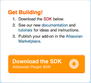
Originally, the developer.atlassian.com welcome page used a highlight box to guide both newbies and updaters:

The highlight box had an incomplete “quickstart” procedure that was too detailed for updaters and over simplified for newbies. Links in each step sent readers to different points in the documentation. The download button did not download the SDK. Rather it took the reader to a page with detailed instructions for both installation and configuration.
Overall, in this old design, readers had 6 choices among the links and the button. Under this design, 5063 users landed on this box and 1116 completed the entire tutorial or 22%.
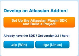
We redesigned this box to reduce choice for both sets of users.

The box headline states the ultimate goal for both groups, to develop an add-on. The orange button is for newbies and takes them directly to the redesigned tutorial. The secondary headline directs updaters to get the latest SDK. Selecting either blue button automatically starts the download process.
The new box was implemented using a Confluence include. This allowed writers to insert the box in other, key locations in the larger documentation library as a way to “advertise” the SDK. Under this new design, 4709 users started the tutorial and 1975 completed it or 41%.
Writing Specific Instructions and Providing Explicit Feedback
The original tutorial consisted of generic instructions for building any project:

To follow the instructions, readers had to decide themselves on which host application and what functionality to add. These decisions required knowledge that a newbie user might not yet have. Moreover, since the tutorial’s goal was to learn the SDK development process, making these decisions were a distraction.
The original tutorial used the same set of instructions for both Windows and Unix users. It also was written to support any IDE the user wanted:

The result was the instructions were not OS-specific enough for newbie users. The procedures had to include decisions trees to support multiple IDEs and so were more complex. Also, because the instructions were not specific and made no assumptions about IDE, there were no feedback loops for users to build a mental model and learn from.
The redesigned tutorial has explicit paths for Windows or Unix users. If a reader lands on the “wrong” page a quick jump link helps them correct course:

Based on Google Analytics we determined most of our newbies were Windows users. Moreover, they most likely had Eclipse as an IDE. So, Eclipse was chosen as the IDE for the tutorial. Users are directed to install and configure a specific version, Indigo.
The redesigned tutorial gives users instructions for creating a specific menu in the Jira application. Since every reader constructs the same project, the tutorial can display the expected result before a reader begins working:

Along the way, instructions direct users to place the project in a specific location. When the SDK calls for input from the reader, the instructions tell readers exactly what to input. This too, allows for the tutorial to include confirmation tasks which readers can use to check their work. In this way, readers can verify their success.
Measuring Success
When we started this redesign we wanted to increase the number of users that completed our tutorial. By that measure, our redesign succeeded. We increased the number of users who worked through the entire tutorial by nearly 20%.
We did not measure ease of use. Was the redesign tutorial easier for users to follow? We can’t know that without a usability test which we did not do before or after. Judging by the feedback, the majority of users report finding the new tutorial “very useful.” However, we know little about the users reporting this — except that they were most likely new to the SDK.
We did learn we can increase the number of users completing an online tutorial by following these guidelines:
- Restrict the choice of entry points but advertise those entry points in multiple locations.
- Reduce the number of independent decisions readers must make by predetermining what the tutorial builds.
- Write specific paths through the tutorial that support any large divisions in reader demographics.
- Provide readers with a feedback loop to confirm and test their understanding.