Create Structured Content with Ease in Confluence 4.2
Confluence 4.2 hit the streets last week and is generating a lot of buzz. It’s taken content collaboration to new heights. It’s never been easier to create compelling content, encourage others to contribute, and discover the content you need to get your job done. Content collaboration is a viral cycle of creation, engagement, and discovery. It’s a cycle that helps teams get work done, faster, and we’re always striving to optimize each step. In Confluence 4.2 we’ve enabled users of all levels to create incredibly engaging, structured content with visual Page Layouts.
New Visual Page Layouts
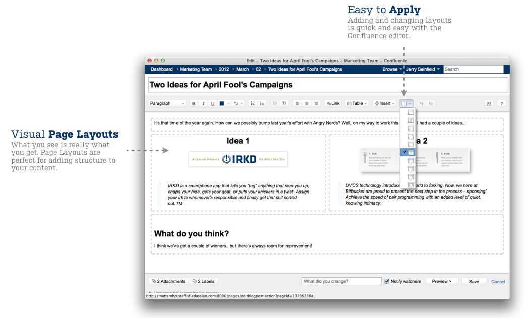
Looking at a blank Confluence page can be pretty daunting, especially if you’re a new user – not anymore. Page Layouts, the latest addition to the ever-evolving editor, make it easy to organize content on your pages and make them pop. Columns, headers, footers, and sidebars – the choice is yours. If you’re the type of person that constantly changes their mind, don’t worry, we’ve got you covered, it’s easy to change your layout at any time.

What you see is really what you get
Seeing is believing, so take a look at Page Layouts in action.
http://www.youtube.com/watch?v=UWtH8KQQ1_c&feature=player_embedded
Try Confluence 4.2 Today
New to Confluence? What are you waiting for, start a free trial today and get up and running in a matter of minutes.
Already using Confluence? You must be itching to upgrade, so be sure to check out our full release notes.